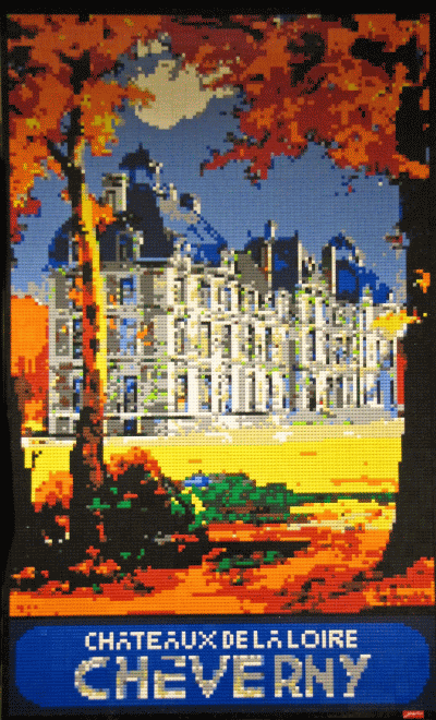
For the 2011 BrickCon show in Seattle, I wanted to build something big, bright, and colorful. I started looking for the right image (which could honestly be a post or 3 in itself, the method, the madness, what makes an image great for mosaics.), and started looking through old travel posters. I came across an image of the Chateaux de Cheverny, from the Loire region of France. Everything popped in the this image, and I knew it was right.
Personally, my favorite thing in this one is the orange in the trees. Contrasted with the black, it really catches your eye. I also love that there are so many colors in it. My palette has expanded in the last year or so, adding dark greens and dark blues. The dark blue can be seen in the roofs, and surrounding the name plate at the bottom. There are 3 shades of blue at work here.

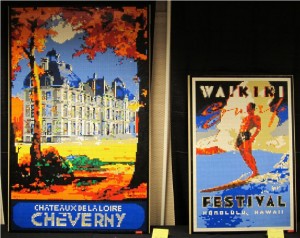
Here’s another picture of the piece next to my other BrickCon large mosaic ‘Waikiki Surf”.
0 Comments
Would you like to share your thoughts?